Guide
Pantone-accurate color across digital and flexo presses: what "consistent" really means
"Pantone-matched." Every label printer's website uses the phrase. Most of them are not actually telling you what they mean by it, and the difference between...
"Pantone-matched." Every label printer's website uses the phrase. Most don't tell you what they mean by it. The difference between marketing-language Pantone matching and operationally-disciplined Pantone matching is the difference between a shelf-consistent brand identity and a brand color that drifts measurably between your spring reorder and your summer reorder.
This post explains what real Pantone color matching requires in production, why "Pantone-matched" without measurement infrastructure is a vague claim, and what to ask a label printer to confirm that your brand colors will hold across runs, presses, and substrates.
Why "Pantone" means something different to designers than to printers
To a designer, Pantone is a color reference system — the Pantone Matching System (PMS) catalog of pre-defined ink colors that gives you a visual swatch and a numbered identifier. "Pantone 375 C" is a specific shade of green documented in a printed reference guide. A designer specifies Pantone 375 C, expects the printed result to look like the swatch, and considers the job done when those two things appear to match.
To a printer, Pantone is a target the press has to hit through a chain of process variables. The ink has to be mixed correctly. The press has to be calibrated for the substrate. Humidity and temperature at the press have to match the conditions the calibration was developed under. The substrate has to behave like the substrate the calibration was developed for. Run-to-run, day-to-day, batch-to-batch, the printer has to hit the same Pantone target — but every variable in the chain shifts slightly. Without measurement instrumentation, the printer hits the target by visual estimation, which is much less precise than the human eye believes.
A brand that asks "do you print Pantone-matched?" and gets a "yes" from a printer without spectrophotometer verification at the press is getting a different operational reality than a brand that gets a "yes" from a printer that runs it. The visual result might look identical for one run. Across multiple runs, multiple presses, multiple substrates, the unmeasured printer's color drifts in ways the measured printer's doesn't.
What spectrophotometer verification actually does
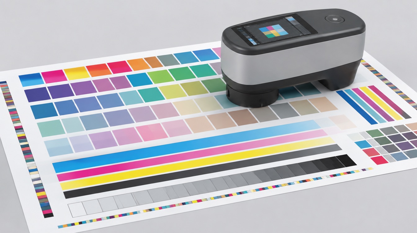
A spectrophotometer quantifies a color in standardized numerical coordinates — typically CIE L*a*b* values (lightness, red-green axis, blue-yellow axis). It takes a printed sample, illuminates it under a standardized light source, and reports the color's exact coordinates within color-science measurement standards.
The Pantone reference for any given color has documented L*a*b* coordinates that define what "Pantone 375 C" actually IS in color-science terms. A press operator who measures a printed sample with a spectrophotometer compares the measured L*a*b* values against the Pantone target L*a*b* values and quantifies exactly how far off the press sits from the target.
The standard tolerance for "Pantone-matched" production is a Delta-E (ΔE) value — the geometric distance between the measured color and the target color in CIE L*a*b* coordinate space. A ΔE below 2.0 is generally considered visually imperceptible. A ΔE of 2.0–3.5 is detectable on close inspection but commercially acceptable for most CPG applications. A ΔE above 3.5 shows at shelf distance and typically fails brand-color-critical work.
Without spectrophotometer measurement, the press operator guesses where they sit in this range. With measurement, they know.
Where color drift comes from in label printing
A few common sources of color drift across runs:
1. Ink formulation variance. Pantone ink gets mixed by combining base inks in measured proportions. Different ink suppliers produce slightly different base formulations, and within a single supplier, different batches vary slightly. A press running Pantone 375 C from ink batch A in March prints slightly differently than the same target color from ink batch B in October.
2. Substrate behavior. The same ink prints differently on coated white BOPP than on uncoated paper than on matte laminated stock. Gloss level, absorbency, and base color all interact with the ink's pigment to produce the final visual result. A brand that uses three substrates across its product line gets three slightly different Pantone 375 C renders unless the printer compensates.
3. Press calibration drift. Flexo presses run anilox rolls that wear, doctor blades that need re-setting, and ink delivery systems that respond to ambient temperature and humidity. Digital presses run toner or ink systems with their own consumable replacement cycles. Without periodic calibration against measured color standards, both press types drift away from their original calibration.
4. Lighting conditions during inspection. A printed sample that looks "matched" under store-floor lighting can look noticeably off under daylight, under warm restaurant lighting, or under retailer LED fixtures. Printers and brands sometimes argue about color match because they're looking at the print under different lighting. Standardized inspection lighting (typically D50 or D65 daylight-simulating fixtures) eliminates that ambiguity.
What real Pantone consistency requires
A printer delivering measurable Pantone consistency runs at minimum:
Spectrophotometer verification at the press. Color samples get measured at the press during makeready. The operator adjusts ink density or formulation to hit the target L*a*b* coordinates within a stated tolerance (typically ΔE < 3.0, with ΔE < 2.0 available as a tighter standard).
Per-substrate calibration. Different substrates get different press calibration profiles. The same Pantone target on coated BOPP vs. matte uncoated paper requires different ink density and possibly different ink formulation to produce the same measured color.
Documented color targets per customer. Each customer's Pantone specs get stored as documented L*a*b* targets, not just "Pantone 375 C." When a brand reorders six months after the first run, the printer measures against the documented target from the original run, not against a generic Pantone reference.
Standardized inspection lighting. Printed samples get evaluated under D50 or D65 standardized lighting to eliminate ambient-light variance from color match decisions.
Press maintenance discipline. Anilox rolls, doctor blades, ink delivery systems, and digital press consumables get maintained and recalibrated on documented schedules.
What "we have a colorimeter" doesn't mean
A colorimeter is a related but less precise instrument than a spectrophotometer. Some printers use colorimeters for in-press color checks because they're cheaper and faster. But colorimeters have inherent limitations — they don't characterize spectral data the way spectrophotometers do, and they're more susceptible to error from substrate variance and measurement geometry.
"We measure color" can mean spectrophotometer-grade measurement against documented L*a*b* targets, or it can mean a colorimeter spot check that catches gross errors but doesn't deliver real Pantone consistency.
The question to ask: "Do you measure with a spectrophotometer and document L*a*b* targets per customer?" Not just "do you measure color."
What to ask your label printer
Five questions get you a real answer about color consistency:
1. What measurement instrument do you use for press color verification? Answer should mention "spectrophotometer" and ideally a specific instrument family (X-Rite, Konica Minolta, Techkon).
2. What ΔE tolerance do you target on Pantone work? Answer should be a specific number (typically 3.0, with 2.0 available as a tighter standard for brand-critical work).
3. Do you store L*a*b* color targets per customer for reorder consistency? Answer should be "yes" — meaning your reorder colors get measured against your specific run history, not against generic Pantone targets.
4. How do you handle Pantone targets across different substrates? Answer should describe per-substrate calibration and potentially per-substrate ink formulation adjustment.
5. What lighting condition do you use for inspection? Answer should be a standardized daylight simulation (D50 or D65) or equivalent.
If a printer's answers to these questions are vague, ask the same questions of a different printer. "Pantone-matched" without measurement infrastructure is marketing, not operations.
What The Label Shoppe runs
Spectrophotometer verification at every press for Pantone work. ΔE tolerance of 3.0 as standard, with ΔE 2.0 available as a tighter standard for brand-critical color work. L*a*b* targets stored per customer, per substrate, per ink formulation — so your March 2024 brand color and your March 2026 brand color hit the same documented target.
Per-substrate calibration profiles for each substrate-ink combination in active production. When a customer's product line uses white BOPP for some SKUs and matte uncoated for others, both substrates calibrate against the same brand color target without one looking visibly off-shade against the other.
Standardized D50 inspection lighting in our color review station. Operators evaluate printed samples under documented light conditions, not whatever fluorescents happen to sit over the production floor.
This is what "Pantone-matched" should actually mean in production. It's not what every printer claiming the phrase delivers, which is why two printers' "Pantone 375 C" can produce visibly different shelf results. We've made the investment in the measurement infrastructure because our customers can audit it.
One call. Consider it done.
Start the Label Launch Path™. A short conversation about how your label program runs today.
Get a Quote. You have specs and you want a price.
Call (626) 333-4001 · Independent since 1991.
// READY TO PRINT
Need labels for your project?
One call. Consider it done.